Hi, I’m Dave, and I’m a WPF newbie. In this post I jump headlong into the exciting world of styling a WPF ListBox, coming face to face with creatures such as templates, styles, brushes and resources.
The aim of this exercise is to display some widgets that the user can select. A widget has both a Name and a Quantity. I’ve got a WidgetListViewModel with a public ObservableCollection<Widget> property called Widgets that our view will bind to. If you’re not familiar with the basics of MVVM, you can get a quick introduction from my attempt at simple MVVM with WPF.
Simple data-binding
Let’s start with our basic view, WidgetListView.xaml:
<Window x:Class="DaveSquared.StylingListBox.WidgetListView"
        xmlns="http://schemas.microsoft.com/winfx/2006/xaml/presentation"
        xmlns:x="http://schemas.microsoft.com/winfx/2006/xaml"
        Title="Widgets" Height="350" Width="525">
    <ListBox ItemsSource="{Binding Widgets}"/>
</Window>
Here we are setting the ItemsSource of our ListBox to bind to something called Widgets. WPF works out what to do with this by search this control’s DataContext for a public property with the same name. If it can’t find it, it will check the control’s parent, parent’s parent etc. until it urns out of parents or finds the property to bind to. In this case I’ve set the DataContext of our window to our view model in the codebehind, WidgetListView.xaml.cs:
public partial class WidgetListView : Window {
    public WidgetListView(WidgetListViewModel viewModel) {
        InitializeComponent();
        DataContext = viewModel;
    }
}
As this view model has a Widgets property, the binding resolves correctly and we get a not-so-useful list of type names:
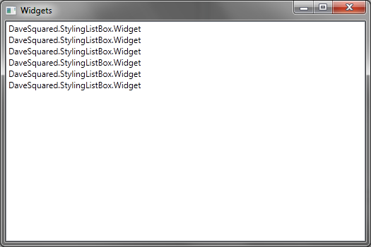
By default, the binding process will just call ToString() on each object. As my Widget class doesn’t implement ToString() we get the default behaviour from Object, which is just the type name. We can fix this by telling our binding to use a specific member for each item. Let’s try using the Name property on each widget.
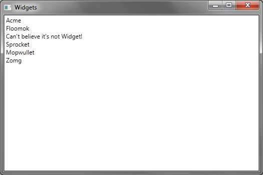
<ListBox ItemsSource="{Binding Widgets}" DisplayMemberPath="Name" />
Displaying more information using DataTemplates
We can now see the name of each widget, but say we also want to display the quantity. One way of doing this is to specify a DataTemplate. We can put this directly in our ListBox using ListBox.ItemTemplate (which we’ll see in the final example), but for now let’s look at how to do this using a DataType-specific template.
<Window x:Class="DaveSquared.StylingListBox.WidgetListView"
        xmlns="http://schemas.microsoft.com/winfx/2006/xaml/presentation"
        xmlns:x="http://schemas.microsoft.com/winfx/2006/xaml"
        xmlns:local="clr-namespace:DaveSquared.StylingListBox"
        Title="Widgets" Height="350" Width="525">
    <Window.Resources>
        <DataTemplate DataType="{x:Type local:Widget}">
            <Border CornerRadius="10" BorderBrush="Black" BorderThickness="1" Margin="1">
                <StackPanel Orientation="Horizontal">
                    <Label Content="{Binding Name}" />
                    <Label Content="{Binding Quantity}" />
                </StackPanel>
            </Border>
        </DataTemplate>
    </Window.Resources>
    <ListBox ItemsSource="{Binding Widgets}" HorizontalContentAlignment="Stretch" />
</Window>
Resources are a way to resuse different elements within WPF. In this case we are adding a DataTemplate to our Window.Resources resource dictionary, so this template can be reused in many places around the window. In this case it isn’t too useful, but it does give some separation between the layout of our main UI elements (our ListBox), and the specific rendering used for it.
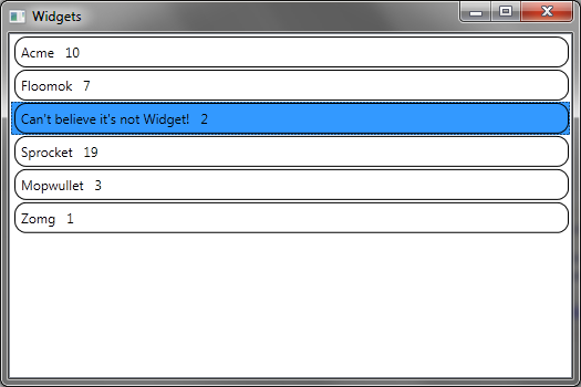
When we run the application, we see each widget rendered with its name and quantity, surrounded by a cheesy looking border:
So how does this work? The ListBox doesn’t have any specific attributes linking it to our DataTemplate. On the template itself however is a DataType attribute that has a cryptic {x:Type local:Widget} value. This is telling WPF that we want this template to be used whenever rendering a bound object of type Widget. The x:Type string tells WPF the attribute is referring to a type (sort of like XAML’s equivalent of typeof). The local: prefix also looks a bit odd. If you check the Window node you’ll see an xmlns:local attribute that has a value of "clr-namespace:DaveSquared.StylingListBox". This is mapping the namespace of my project into XAML, so local:Widget resolves to the DaveSquared.StylingListBox.Widget type.
So each widget ends up getting its border, and two labels arranges horizontally thanks to a StackPanel. We’ve also had to add a HorizontalContentAlignment="Stretch" attribute to our listbox, other wise each listbox item would be a different width depending on its name’s length. Telling the listbox to stretch its items horizontally makes each item take up the full width of the listbox. We didn’t need to worry about this before as we didn’t have a border to make the width obvious.
Adding a touch of style
There’s a few interesting things happening with our current code. First, the highlighting of the selected item does not take any notice of our border, so it just highlights the entire item, which looks a bit strange. The second thing to notice is that we are mixing data-binding specific markup (binding to our name and quantity properties) with more general presentation concerns (putting rounded borders around items). Let’s look at fixing the second issue, as it will end up helping us with the first.
Now rounded borders don’t have any relation to widgets; we could easily imagine having sprockets or doodads displayed with rounded borders. So let’s separate the widget-specific markup from our general item style. Let’s see the XAML first, then we’ll step through it.
    <Window.Resources>
        <Style x:Key="RoundedItem" TargetType="ListBoxItem">
            <Setter Property="Template">
                <Setter.Value>
                    <ControlTemplate TargetType="ListBoxItem">
                        <Border CornerRadius="10" BorderBrush="Black" BorderThickness="1" Margin="1">
                            <ContentPresenter />
                        </Border>
                    </ControlTemplate>
                </Setter.Value>
            </Setter>
        </Style>
        <DataTemplate DataType="{x:Type local:Widget}">
            <StackPanel Orientation="Horizontal">
                <Label Content="{Binding Name}" />
                <Label Content="{Binding Quantity}" />
            </StackPanel>
        </DataTemplate>
    </Window.Resources>
    <ListBox ItemsSource="{Binding Widgets}" ItemContainerStyle="{StaticResource RoundedItem}" HorizontalContentAlignment="Stretch" />
Here we’ve moved the non-binding specific markup from our DataTemplate into a Style. We’ve given it a key so we can refer to it by the string "RoundedItem", and set a target type so it can be applied to any ListBoxItem. If we don’t set a target type, then we won’t be able to access any ListBoxItem specific properties.
{x:Type} thing to refer to ListBoxItem. I’m not sure why, but it is probably something to do with it being a built-in WPF type. Maybe the type converter automatically searches built-in types.Our RoundedItem style is going to set the Template property of the styled ListboxItem to be the ControlTemplate we specify, which is just our cheesy rounded border. Inside the border element is a <ContentPresenter /> node. This is going to render our item with whatever template is applied to the contents. In our case, this is our existing DataTemplate, which now just contains the widget-specific binding markup. The style is being applied to the ListBoxItem container, whereas the template is being applied to the bound widget. They are linked by the ContentPresenter element in the style.
To apply this we just add a ItemContainerStyle="{StaticResource RoundedItem}" attribute to our ListBox. (Note: ListBox.Style will apply to the listbox itself, whereas ListBox.ItemContainerStyle is the style used for each ListBoxItem.) The {StaticResource} value tells WPF to try and find the named resource in its various resource dictionaries (similar to how DataContext is searched for binding). WPF also has a {DynamicResource} which is used for resources that can change, and so need to be reevaluated throughout the life of the control. As our resources for this example are static we won’t need that here.
Our app looks the same until we try to select an item and find that it does not get hightlighted. This is because we’ve overriden the ListBoxItem template that previously did this for us. Luckily we are now in a good position to not only restore the highlighting, but also fix it so it only highlights within the border of the item.
Triggers
To reinstate the highlighting, we can add a trigger to our ControlTemplate in our RoundedItem style to update our item when a particular property changes.
<ControlTemplate TargetType="ListBoxItem">
    <Border Name="ItemBorder" CornerRadius="10" BorderBrush="Black" BorderThickness="1" Margin="1" Background="Transparent">
        <ContentPresenter />
    </Border>
    <ControlTemplate.Triggers>
        <Trigger Property="IsSelected" Value="True">
            <Setter TargetName="ItemBorder" Property="Background" Value="LightBlue" />
        </Trigger>
    </ControlTemplate.Triggers>
</ControlTemplate>
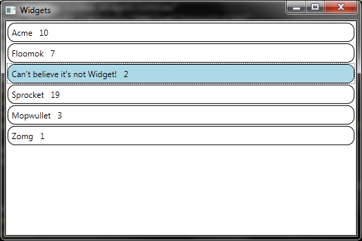
Here we’re telling our template that when the IsSelected property of our ListBoxItem is true, we want the background of our border element set to light blue. Notice we’ve given the border element a name ("ItemBorder") so that we can refer to it in our trigger’s Setter. We also need to specify a starting background (in this case I’ve set it to transparent), otherwise it won’t change back properly when the item is unselected (it needs to have an initial value to revert to).
MultiTriggers
But we don’t have to stop there. Let’s also change the background when an item is hovered over. Now this one is a bit trickier, as we don’t want to change the background of a selected item that is hovered over, only of unselected items (otherwise the selected item will appear to lose its selection). The answer is a MultiTrigger:
<ControlTemplate.Triggers>
    <Trigger Property="IsSelected" Value="True">
        <Setter TargetName="ItemBorder" Property="Background" Value="LightBlue" />
    </Trigger>
    <MultiTrigger>
        <MultiTrigger.Conditions>
            <Condition Property="IsMouseOver" Value="True" />
            <Condition Property="IsSelected" Value="False" />
        </MultiTrigger.Conditions>
        <Setter TargetName="ItemBorder" Property="Background" Value="Azure" />
    </MultiTrigger>
</ControlTemplate.Triggers>
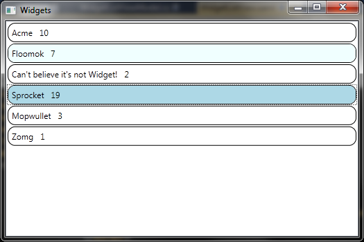
Here we’ve set two conditions necessary for the multitrigger to be applied, IsMouseOver must be true, and IsSelected must be false. If these conditions are satisfied then we’ll set the background to azure, and get this effect:
Tidying up
I mentioned earlier that resources enabled us to share styles and templates across controls, windows or even applications. We can even create and load resource dictionaries to provide different themes for applications. Let’s move some of the more general pieces of markup into our application dictionary. To do this, we’ll open our App.xaml (or whatever Application class we have) and drop our RoundedItem style in there.
<Application x:Class="DaveSquared.StylingListBox.App"
             xmlns="http://schemas.microsoft.com/winfx/2006/xaml/presentation"
             xmlns:x="http://schemas.microsoft.com/winfx/2006/xaml"
             >
    <Application.Resources>
        <SolidColorBrush x:Key="ItemBrush" Color="Transparent" />
        <SolidColorBrush x:Key="SelectedItemBrush" Color="LightBlue" />
        <SolidColorBrush x:Key="HoverItemBrush" Color="Azure" />
        <Style x:Key="RoundedItem" TargetType="ListBoxItem">
            <Setter Property="Template">
                <Setter.Value>
                    <ControlTemplate TargetType="ListBoxItem">
                        <Border Name="ItemBorder" CornerRadius="10" BorderBrush="Black" BorderThickness="1" Margin="1" Background="{StaticResource ItemBrush}">
                            <ContentPresenter />
                        </Border>
                        <ControlTemplate.Triggers>
                            <Trigger Property="IsSelected" Value="True">
                                <Setter TargetName="ItemBorder" Property="Background" Value="{StaticResource SelectedItemBrush}" />
                            </Trigger>
                            <MultiTrigger>
                                <MultiTrigger.Conditions>
                                    <Condition Property="IsMouseOver" Value="True" />
                                    <Condition Property="IsSelected" Value="False" />
                                </MultiTrigger.Conditions>
                                <Setter TargetName="ItemBorder" Property="Background" Value="{StaticResource HoverItemBrush}" />
                            </MultiTrigger>
                        </ControlTemplate.Triggers>
                    </ControlTemplate>
                </Setter.Value>
            </Setter>
        </Style>
    </Application.Resources>
</Application>
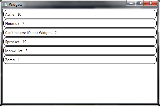
Here we’ve also pulled out the brushes we’re using to paint our border backgrounds. This will allow use to use common colours for selected and hovered-over screen elements. This means we can get a much lighter view:
<Window x:Class="DaveSquared.StylingListBox.WidgetListView"
        xmlns="http://schemas.microsoft.com/winfx/2006/xaml/presentation"
        xmlns:x="http://schemas.microsoft.com/winfx/2006/xaml"
        Title="Widgets" Height="350" Width="525">
    <ListBox ItemsSource="{Binding Widgets}" ItemContainerStyle="{StaticResource RoundedItem}" HorizontalContentAlignment="Stretch">
        <ListBox.ItemTemplate>
            <DataTemplate>
                <StackPanel Orientation="Horizontal">
                    <Label Content="{Binding Name}" />
                    <Label Content="{Binding Quantity}" />
                </StackPanel>
            </DataTemplate>
        </ListBox.ItemTemplate>
    </ListBox>
</Window>
As I mentioned towards the beginning of this post, we can also stick our DataTemplate directly in the listbox using the ListBox.ItemTemplate. We’ve done so here to get rid of our specific Window resources, and we no longer need to directly specify the target type of the template. I probably should have done this to begin with, but at least we got to see how target types work. :)
Now you can do much more with this stuff, but at least we’ve covered some of the key elements we need to apply styles and templates to our WPF controls. Hope this helps any fellow WPF newbies out there. Comments and corrections welcomed.